
Caliplaces is Changing Its Logo
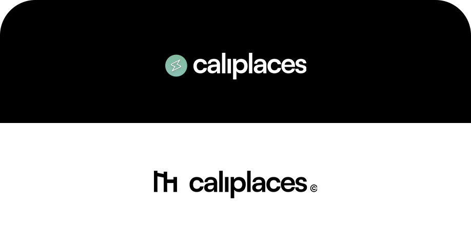
After months of inactivity on our end, we are thrilled to present to you one of our biggest changes so far: our new logo.
This update represents more than just a fresh design — it’s a reflection of the journey Caliplaces is on, and the vision we have for the future.
Why We’re Changing
Logos are more than shapes and colors — they tell a story. Our original design served us well as we were starting out, but as Caliplaces has grown, we’ve felt the need for a symbol that better captures who we are today:
- A community-first platform for calisthenics and travel.
- A brand that balances strength, exploration, and creativity.
- A movement that goes beyond just places — it’s about experiences.
The New Look
Our new logo introduces a bolder, cleaner design that feels modern and adaptable across all our platforms — from the app and website to events and merchandise. It’s built to scale with us as we continue to grow.
The design aims to be:
- Minimal: Simple enough to be instantly recognisable.
- Dynamic: A logo that works across both digital and physical spaces.
- Meaningful: A mark that embodies energy, progress, and connection.
What This Means for You
For now, the most visible change will be on our website, app, and social channels. Over the coming weeks, you’ll start seeing the new logo appear everywhere across Caliplaces, including our shop and video platform.
This is the first of many updates coming your way — all aimed at making Caliplaces not just an app, but a true home for calisthenics enthusiasts around the world.
Thank You for Growing With Us
We know change can be surprising, but we’re excited to take this step forward together. Your support has carried Caliplaces from an idea into a growing community, and this new logo is just one piece of a bigger vision we’re building.
Here’s to new beginnings — stronger, sharper, and more connected than ever.
👉 What do you think of the new logo? Let us know — your feedback helps us shape the future of Caliplaces.